
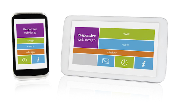
 You’ve probably already heard about all the hoopla around have a website that displays well not only on PCs and laptops, but also on mobile devices such as cell phones and tablets. The technical term is “responsive”.
In April 2015, this became even more of a priority with Google using mobile-friendliness as a ranking factor in searches.
One of the reasons I love the Thesis 2 theme, is because it has built-in responsive functionality. Older versions of Thesis (1.8 and earlier) aren’t responsive. Some other themes are responsive and others aren’t.
You can check your site here: www.responsinator.com Type in your URL and you’ll be able to see what your site looks like on different devices. A responsive site will automatically adjust content so that you don’t have to scroll sideways to view the full width of content.
I would be happy to review your site and give you a quote on what it would take to upgrade your site to Thesis 2, reapply styling, and ensure that all your content is nice and responsive.
Contact me if you’d like more information.